Why Color Matters More Than You Think
Color is far more than a design choice it’s a strategic asset that directly influences how a brand is perceived, remembered, and experienced. In a world where attention spans are shrinking and competition is intense, color becomes one of the fastest ways to communicate meaning without saying a word.
Studies suggest that people form first impressions within seconds, and up to 90% of that initial judgment can be influenced by color. Before a customer reads your tagline or understands your offering, they feel your brand and color is often the first trigger of that emotional response.
From packaging to websites, logos to advertisements, color silently shapes perception. It can signal trust, create urgency, evoke comfort, or establish authority—all within a glance.
The Science Behind Color Psychology
Color psychology is rooted in how our brains process visual stimuli. Different colors stimulate different parts of the brain, influencing mood, behavior, and decision-making. While some responses are universal (like red signaling urgency), others are shaped by personal experiences and cultural background.
This is why color selection in branding should never be random—it should be intentional, research-driven, and aligned with your brand’s personality
Decoding Colors: What They Really Communicate
🔴 Red – Energy, Passion, Urgency Red is bold and attention-grabbing. It increases heart rate and creates a sense of excitement. Brands use red to evoke strong emotions, encourage action, and stand out in crowded spaces.
- Coca-Cola
- YouTube
- Netflix
Why they use it: Red grabs attention instantly and creates excitement. It also encourages quick decisions—perfect for entertainment and impulse-driven platforms.
A classic example is Coca-Cola.
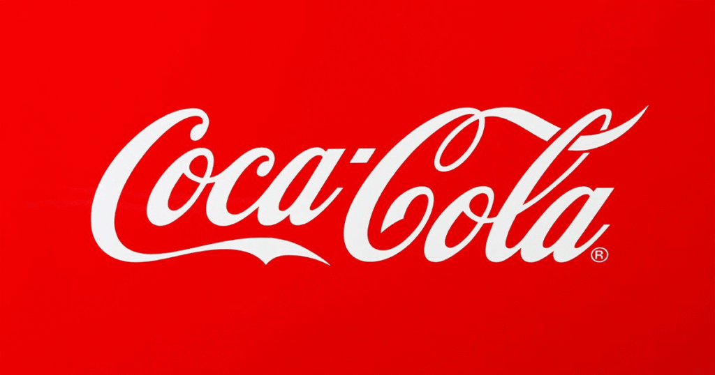
COCA-COLA
Red is bold, energetic, and emotionally intense. Coca-Cola uses red to create excitement and strong emotional connections. It also stimulates appetite and encourages impulse decisions—perfect for a consumer product.
👉 Insight: Red works when your goal is to grab attention and create excitement quickly.
🔵 Blue – Trust, Stability, Professionalism Blue is one of the most widely used colors in branding because it builds trust and conveys reliability. It’s calming, dependable, and often associated with logic and security—making it popular in finance, healthcare, and technology.
- IBM
Why they use it: Blue builds trust, security, and professionalism. These brands rely on user data and long-term relationships, so a calming and dependable color reinforces credibility.
👉 Takeaway: If your brand is about trust (finance, tech, consulting), blue is a safe and powerful choice.
Take LinkedIn as an example.

Blue is associated with trust, professionalism, and stability—exactly what a platform built around careers and networking needs. When users share personal achievements, resumes, and business insights, they need to feel secure. LinkedIn’s blue reinforces credibility and makes the platform feel dependable.
👉 Insight: If your brand relies on trust and long-term relationships, blue helps reduce uncertainty.
🟡 Yellow – Optimism, Warmth, Positivity Yellow captures attention while evoking happiness and friendliness. It’s often used to create a sense of cheerfulness, but must be balanced carefully to avoid overwhelming the viewer.
- McDonald’s
- Snapchat
- IKEA
Why they use it: Yellow evokes happiness, warmth, and positivity. It’s inviting and youthful, making brands feel more approachable.
👉 Takeaway: Great for brands targeting a broad or younger audience.
Look at McDonald’s.

Yellow evokes happiness, warmth, and positivity. It’s highly visible and instantly uplifting. McDonald’s uses yellow to create a welcoming and cheerful atmosphere, especially appealing to families and children.
👉 Insight: Yellow is ideal for brands that want to feel approachable and energetic.
🟢 Green – Growth, Health, Sustainability Green is strongly linked to nature, balance, and renewal. It works well for brands focused on wellness, sustainability, and environmental responsibility, while also symbolizing prosperity and growth.
- Starbucks
- Spotify
- Whole Foods Market
Why they use it: Green symbolizes health, freshness, and balance. It also strongly connects with eco-conscious values.
👉 Takeaway: Ideal for wellness, finance (growth), and sustainability-focused brands.
A strong example is Starbucks.
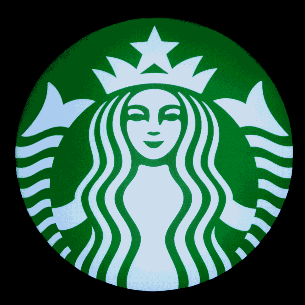
Green represents nature, calmness, and growth. Starbucks uses green to create a relaxing, refreshing brand experience—almost like a break from daily stress. It also subtly connects to sustainability and ethical sourcing.
👉 Insight: Green is perfect for brands focused on wellness, nature, or balance.
⚫ Black – Luxury, Power, Sophistication Black communicates elegance and exclusivity. It’s often used by premium brands to create a sense of authority and timeless appeal.
- Nike
- Chanel
- Apple
Why they use it: Black communicates elegance, power, and exclusivity. It creates a premium feel and timeless identity.
👉 Takeaway: Perfect for high-end or minimalist brands.
A great example is Nike.
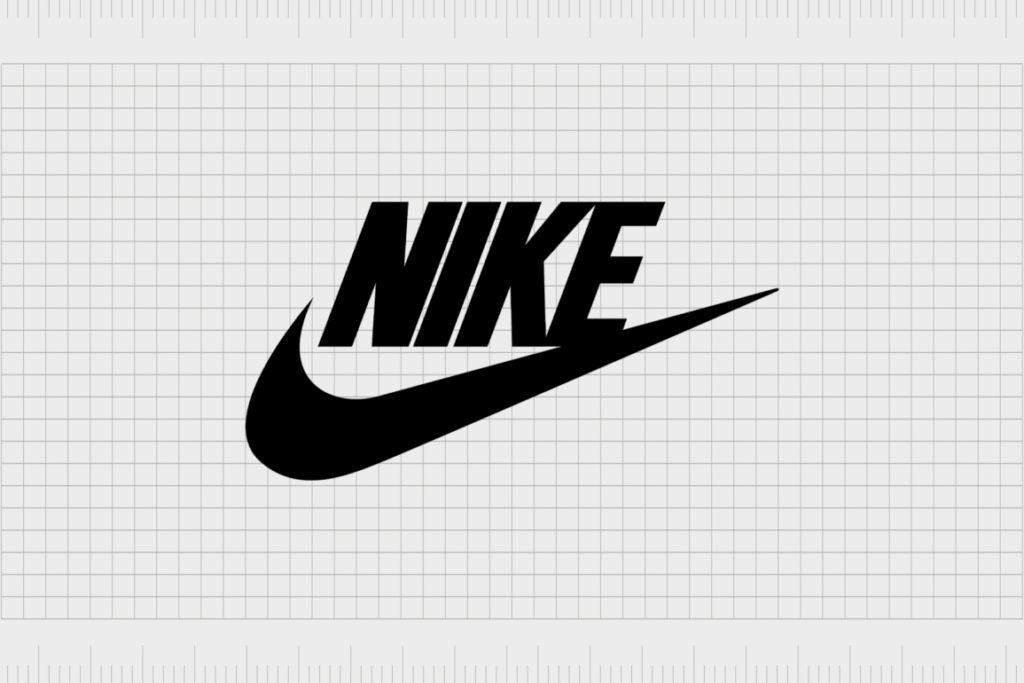
Black in Nike’s branding represents strength, dominance, and confidence. Unlike luxury brands that use black for elegance, Nike uses it to communicate power and performance. The iconic swoosh in black feels bold, sharp, and instantly recognizable.
The simplicity of black also aligns perfectly with Nike’s messaging—focused, no distractions, just performance. It creates a sense of seriousness and determination, which resonates strongly with athletes and fitness enthusiasts.
Black allows Nike to maintain a universal and versatile identity. It works across all products, campaigns, and markets while keeping the brand consistent and impactful.
👉 Psychological Insight: Black here signals control, discipline, and authority, motivating consumers to feel stronger and more confident.
👉 Strategic Use:
- Ideal for brands focused on performance and strength
- Creates a bold and confident identity
- Works well in minimalist, high-impact designs
🟣 Purple – Creativity, Innovation, Imagination Purple blends the stability of blue and the energy of red, making it ideal for brands that want to appear creative, unique, and forward-thinking.
- Cadbury
- Twitch
- Hallmark
Why they use it: Purple blends energy and stability, often linked to creativity and uniqueness.
👉 Takeaway: Works well for brands that want to stand out and feel imaginative
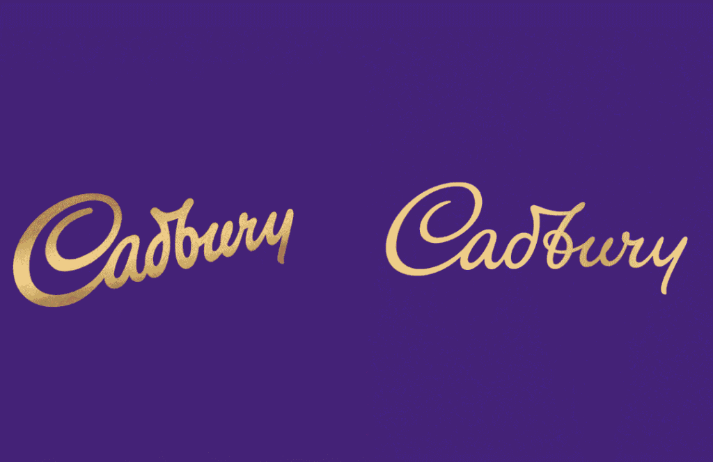
Purple is often linked to creativity, indulgence, and a sense of luxury. Cadbury uses it to differentiate itself and create a rich, premium feel while still being playful and memorable.
👉 Insight: Purple is great for brands that want to stand out and feel imaginative or distinctive.
The Role of Color in Brand Positioning
Color helps position your brand in the minds of consumers. For example:
- A fintech startup might choose blue to signal trust and security.
- A fitness brand may use red or orange to convey energy and action.
- A luxury brand might rely on black or deep tones to express exclusivity.
The key is alignment—your color palette should reflect your brand’s values, tone, and target audience.
Consistency: The Secret to Brand Recall
One of the most powerful aspects of color is its ability to improve recognition. When used consistently across all touchpoints—logo, website, social media, packaging—it strengthens memory and builds familiarity.
Think about how quickly you can identify a brand just by its color scheme. That’s not accidental—it’s strategic consistency over time.
Cultural and Contextual Sensitivity
Color meanings are not universal. For instance, while white symbolizes purity in some cultures, it represents mourning in others. Similarly, red can signify luck in certain regions and danger in others.
Brands that operate globally must adapt their color strategies to resonate with local audiences while maintaining a cohesive identity.
Beyond Aesthetics: Color as a Competitive Advantage
In saturated markets, where products and services can feel similar, color becomes a differentiator. It helps brands stand out, communicate faster, and create emotional connections that drive loyalty.
Choosing the right color isn’t just about looking good—it’s about being remembered, trusted, and chosen.
Final Thoughts
Color is the silent language of branding. It speaks directly to emotions, influences perception, and shapes decisions—often before logic even comes into play.
So the real question is: Are your brand colors just visually appealing or are they strategically working for you?